
Novel Graphics
How much do you appreciate the Statcast 3D Powered By Google Cloud?

Here’s something that happens every trip back home: My dad and I are watching the start of a Giants game, the broadcast shows the Statcast 3D Powered By Google Cloud pitcher scouting report,
and Dad asks if I understand what all of that graphic is supposed to be showing. I say that of course I do. (Being home turns me back into a psychological teenager, so of course I understand everything.) Before I can explain any of it, the graphic is over and disappears.
I’ve probably seen those graphics… oh, 2,000 times since broadcasts started using them around 2021. But the truth is, I don’t ever really look at them. The truth is, I might only kind of understand them—not well enough to know how to make them work for me. So this is me trying to answer one father’s persistent question, and figure out why this beautiful and awesome and energy-intensive thing is not quite accomplishing what it’s supposed to for either of us.
Pt. 1: What it shows
This graphic shows ~four things, in increasing complexity—
Complexity Level 1: What types of pitches the pitcher throws, and how often he throws them. This is all written in the text box to the side, the 2D part of the graphic. Those usage rates then flip over to display something else about each pitch type, sometimes average pitch velocity, sometimes slugging percentage or batting average against:
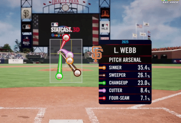
Complexity Level 2: Where each pitch type is thrown most often. Each zooming 3D baseball lands in the part of the zone that the pitcher hits most often with each pitch type.
In the case of the Blake Snell graphic, at the top of this article, we see a tidy narrative, easy to grasp: Snell throws fastballs high and everything else low, a concise modern strikeout pitcher. For seven-pitch junkballers, the spray is a bit more cacophonic, but theoretically it’s teaching you some of the same things. From Randy Vásquez’ graphic,
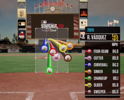
you might deduce that he buries the changeup low as a chase pitch; that the sinker is a front-hip comebacker; that the cutter, sitting in the middle of the zone, is more for missing barrels than getting chase-and-miss; etc.
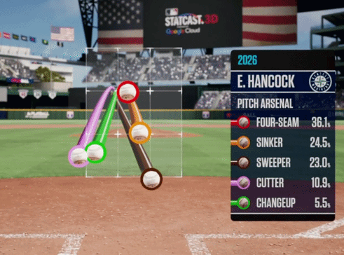
Complexity Level 3: The shape of each pitch, how much it moves on the way to the plate. At the start of the graphic, seeing the pitches in partial profile, we can (theoretically) see sink vs. “rise.” Then, after the camera slides over to the umpire’s position, we can (theoretically) see left-to-right or right-to-left. Alas, from the close-up behind-home angle, these differences are extremely subtle. In real life, for instance Emerson Hancock’s cutter (the violet) and changeup (the green) move 20 inches in opposite directions, but on the graphic they look like buddies:
Complexity Level 4: The slightly different release points for each pitch; the spin axis (as shown in the different spin directions of each ball); and, perhaps, the tunneling effects of pitches that start out looking the same but diverge midway, fooling batters. This is information that, even if we really want to care, most of us (including your neighborhood newsletter writer) don’t really have the expertise to interpret, at least in 10 seconds of 3D powered by Google Cloud.
So in summary: The text box shows what the pitcher throws; the zone box tries to show where he throws it; and all the moving parts show pitch physics, which are very fancy but a little bit ehhhhhhh as far as general usefulness.
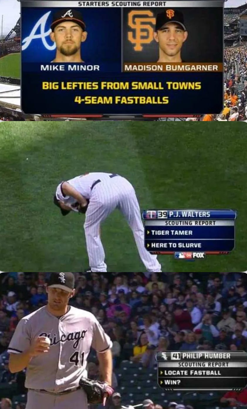
Now, for most of my life, all that broadcasts gave us for pitcher scouting reports were a few topline stats and some bad attempts at tying repertoire to wordplay:
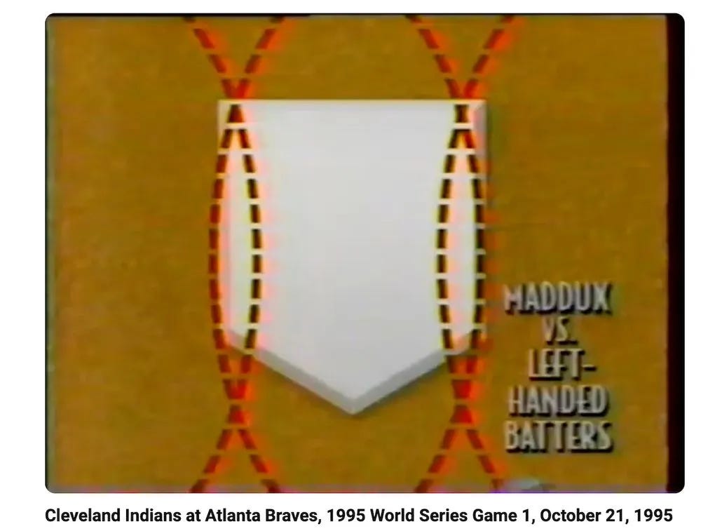
In the 2000s we started getting lefty-righty splits on the stats. In the 2010s, we got pitch breakdowns (45 percent fastball, 22 percent slider, etc.) Now we have precise three-dimensional representations of each pitch type, laid atop each other so we can see how they interplay with each other! It’s pretty miraculous! To get from this
to the Statcast 3D graphic is like going from horse and buggies to space ships in one lifetime. We are swimming in graphic abundance.
Pt. 2: Where It’s Losing Us
And yet, this incredible achievement mostly loses my dad and mostly fails to interest me.
